

Background
SolLiz is a part of the cryptocurrency realm and specifically is a meme coin on Solana, a blockchain platform, known for it’s speed and scalability. You might be wondering, why would someone want to invest in a meme coin? People are drawn to coins like SolLiz for speculative opportunities, community engagement, entertainment, and the potential for quick gains fueled by hype and social media. Plus, meme coins often appeal to those who enjoy vibrant communities or want to support causes linked to the coin.

Problem Statement
As the coin had no visibility yet, I needed to help establish credibility, by creating a platform that serves as an information hub and to build a strong community to gain trust and engagement among users and investors. Now how could I make SolLiz stand out?

The Solution
To differentiate ourselves from competitors, having a fun and enjoyable experience is crucial. By establishing an identity, in this case of a frog as the mascot and face of the platform, it adds to this element of “meme”. Creativity is reflected in the visual branding and its message to promote the product to engage investors and users.
Branding Guidelines
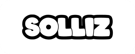
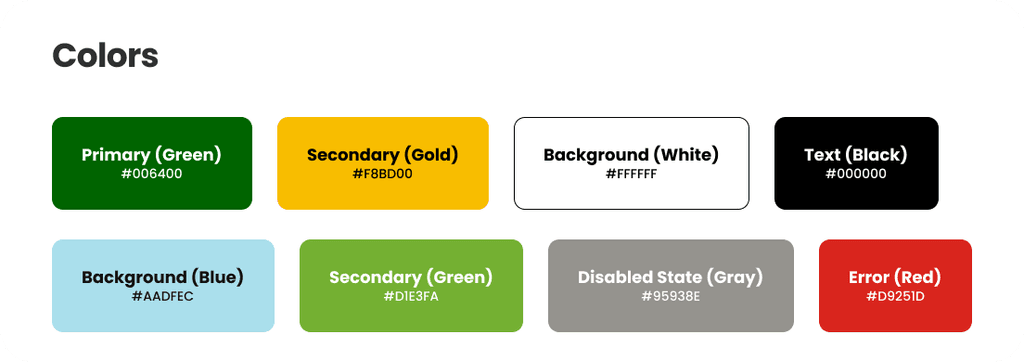
The branding for Solliz emphasizes a bold and fun aesthetic. The bubble letter logo in white with a black stroke creates a playful yet standout identity. The font selection provide balance between boldness and readability, while the color palette adds vibrancy and cohesion to the design. Icons were used from the Iconify library.

Final Prototypes
I focused a lot on the interface of the website focusing on a smooth and modern look, to match the meme coin standard. After ideating here were the final results!
Created a cohesive design system for visual consistency and audience trust
Easy access to information to buy crypto and learn more about it
Designed responsive versions for both mobile and web
Reflections &
Takeaways
This solo project challenged me to manage all aspects of the design, from creating a design system from scratch to focusing heavily on visual design. The creative freedom allowed me to experiment with trends in the crypto space while ensuring the design was functional and user-friendly. A key takeaway was the importance of balancing aesthetics with usability, especially in a rapidly evolving industry. This experience strengthened my ability to take ownership of projects and design holistically, from concept to execution.